Ecommerce Design Is Critical (but Misunderstood)

Designers commonly claim their role is critical to ecommerce success. Yet non-designers often counter by citing Amazon and other high-converting sites that are, seemingly, design agnostic.
Designers are right in that appearance and layout play a key role in conversion but not how many have understood it.
Trends and styles may look attractive at first, but they often become obsolete or ubiquitous or are hard to achieve or maintain. And many are just good on the eye at the expense of conversions.
The goal should not be the trendiest website or the best-looking but to allow the design to speak to the right audience, increasing conversions based on a defined strategy.
Three factors determine the design of a high-converting ecommerce site: audience, strategy, and content. Audience
Narrowing your audience is the first step. It dictates the actions you want your ideal customers to take and what speaks to them visually.
And the wider the audience, the larger the budget to gain and maintain traction.
A well-defined audience allows laser focus to gain momentum faster and create raving, tribe-like fans.
Start by defining the age of your ideal client, considering that design preferences change from generation to generation. Examples are font size, font style, and color choices.
Those differences influence not just how users navigate websites but also how they read the content.
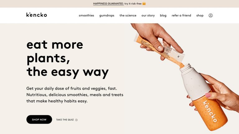
Psychographics — interests, options, activities — are also important.Picture your ideal client sitting across the table from you in a coffee shop. The closer you can get to visualizing this person’s face and imagining her life story, the easier it will be to define the strategy and content.Take The Great Cookie , for example. It appeals to Baby Boomers (age 60 and older, roughly) with larger fonts, an old-fashioned logo, and easy search by occasion. The design of The Great Cookie appeals to Baby Boomers. Click image to enlarge. Modsy , an online interior design firm, focuses on results. This appeals to Gen Xers (age 40 to 60), who also relate to the site’s smaller font in dark grey instead of black. Modsy’s focus on results appeals to Gen Xers, as does the site’s smaller font in dark grey. Click image to enlarge. Kencko , which sells nutritious food products, applies emojis and no-caps sentences and words that mimic the messaging tools Millennials (age 25 to 40) use daily. The short video with no audio addresses the habits of that generation, too. Kencko applies emojis […]
Click here to view original web page at www.practicalecommerce.com
I am a robot. This article is curated from another source (e.g. videos, images, articles, etc.). For the complete article please use the link provided to visit the original source or author. Content from other websites behaves in the exact same way as if the visitor has visited the other website.
Warning: The views and opinions expressed are those of the authors and do not necessarily reflect the official policy or position of MichelPaquin.com.
